Color Themes
The Theme Tools panel supports custom themes defined as JSON. This page documents the theme format and matcher syntax.
Theme JSON Structure
A theme is a JSON object with the following shape:
{
  "name": "My Theme",
  "backgroundColor": "#eeeeee",
  "rules": [
    {
      "name": "Default",
      "colors": { "color": "#cccccc", "defaultTextColor": "#000000" }
    },
    {
      "name": "Modifiers",
      "matchers": "width > 1",
      "colors": { "color": "#aaaaaa" }
    }
  ]
}
Rules are evaluated in order from first to last — later rules take priority (last-match-wins). The first rule without a matchers field acts as the fallback for all keys.
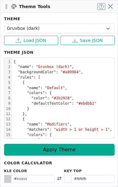
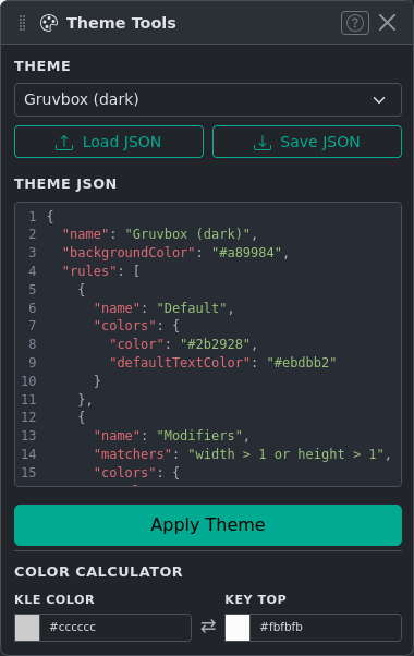
You can edit the current theme directly in the JSON editor within the Theme Tools panel, or load/save theme files using Load JSON and Save JSON.
Matcher Syntax
Each rule can have a matchers string that determines which keys it applies to. The ? button in the panel shows a quick reference.
Matcher Types
| Category | Syntax |
|---|---|
| Numeric properties | width, height, x, y, rotation with operators >, >=, <, <=, ==, != |
| Boolean flags | decal, ghost, stepped, nub — use bare name to test if set |
| Label check | label == "Esc", label[0] matches "^F\d+$", label contains "Shift" |
| Logic | and, or, not, ( ) |
Matcher Examples
width >= 1.5
width >= 6 and not decal
label == "Esc"
label[0] matches "^F\d+$"
not (ghost or decal)
rotation != 0
Color Calculator
The Theme Tools panel includes a Color Calculator that converts between the KLE keycap color (the background color stored in the layout) and the rendered key-top color (which appears lighter due to simulated lighting). Enter either color to compute the other. This is useful when designing a theme to match a specific keycap color.