Key Properties
The Key Properties panel is enabled whenever one or more keys are selected. When multiple keys are selected, editing a property applies it to all selected keys simultaneously.
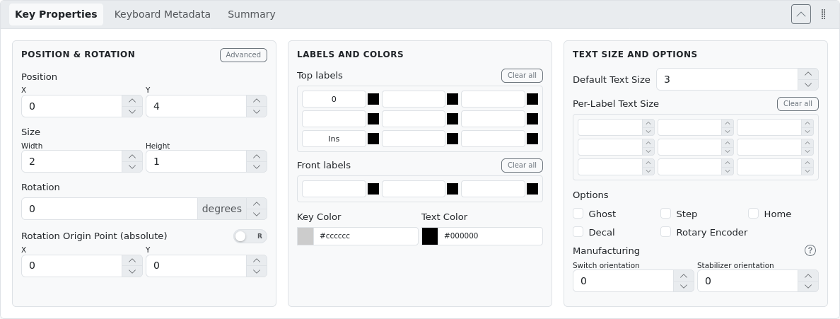
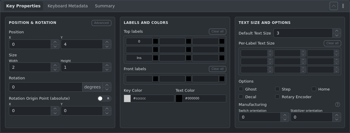
Position & Rotation
| Field | Description |
|---|---|
| X, Y | Position of the key's top-left corner in U |
| Width, Height | Key dimensions in U. Step size is 0.25U by default |
| Rotation | Rotation angle in degrees. Positive values rotate clockwise |
| Rotation Origin X/Y | The point around which the key rotates, in absolute U coordinates |
Rotation Origin Modes
Absolute vs. Relative rotation origin: Use the A/R toggle to switch between absolute (default) and relative rotation origin modes. In relative mode, the X/Y offsets are measured from the key's own top-left corner rather than from the canvas origin.
Advanced Position Mode
Click the Advanced button to expose secondary position and size fields (X2, Y2, Width2, Height2). These define a second rectangular region combined with the primary one to produce non-rectangular key shapes such as ISO Enter and Big-Ass Enter. Most users do not need to use these directly.
Labels
Each key has up to 12 label positions: 9 positions on the top face of the keycap (the part you see when looking down) and 3 positions on the front face (the vertical edge facing you when typing).
The 9 top-label positions map to a 3×3 grid:
| Top-Left | Top-Center | Top-Right |
| Center-Left | Center | Center-Right |
| Bottom-Left | Bottom-Center | Bottom-Right |
Front labels appear on the front face of the key, useful for representing secondary or shine-through legends.
Label Colors
Each label position has an independent color picker next to the input field. The color applies only to that label position. The global Text Color field sets a default color for all labels that don't have a per-label color override.
Use Clear all to remove all labels at once from either the top or front face.
Text Size
Default Text Size applies to all labels on the selected key(s) that don't have a per-label size set. Values range from 1 (smallest) to 9 (largest).
Per-Label Text Size lets you set individual sizes for each label position using the same 3×3 grid layout. Leave a position empty to inherit the default size.
Key Options
| Option | Description |
|---|---|
| Ghost | Renders the key as transparent/invisible. Used in plate generation to define outline shapes without producing switch cutouts |
| Step (Stepped) | Renders the key with a stepped profile (lower right portion). Used for stepped Caps Lock keycaps |
| Home (Nub) | Indicates this key has a homing bar or bump (e.g., F and J on standard layouts) |
| Decal | Marks the key as a decorative element only — no switch cutout is generated in the plate |
| Rotary Encoder | Marks the key as a rotary encoder. Height cannot be edited for encoders |
Colors
- Key Color — Background color of the keycap
- Text Color — Default color for all labels on this key
Both fields accept hex color values and provide a color picker. Type directly in the text field or click the color swatch.
INFO
The Key Color value represents the color of the shaded part (sides/border) of the keycap. The top face color is not configurable directly — it is derived automatically via a color transformation (brightening) applied to the Key Color. To convert between the stored key color and the rendered key-top color, use the Color Calculator available in the Theme Tools panel.
Image and SVG Labels
Key labels support embedding images and SVG graphics. Images align to the inner keycap surface (the visible face of the key, excluding the border).
| Example | Layout JSON |
|---|---|
External Image URL  | json
|
Inline SVG  | json
|
Manufacturing Properties
Manufacturing properties control how switches and stabilizers are physically mounted. These settings are used by the Plate Generator and PCB Generator.
The Switch orientation and Stabilizer orientation properties allow you to define the mounting orientation of physical switches and their stabilizers.
- These rotations are applied by the Plate Generator independently, on top of layout rotations
- Values must be a multiple of 90°
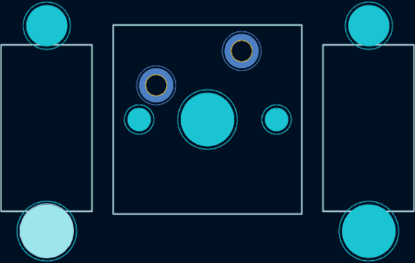
Most plate stabilizer cutout types are unidirectional, which forces a specific mounting orientation on the plate or PCB. Always validate that the stabilizer cutout matches the intended mounting orientation.
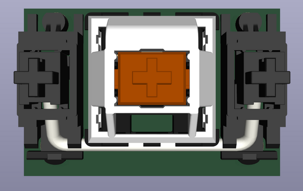
Cherry MX PCB Stabilizer Example
For a Cherry MX PCB-mounted stabilizer with the wire facing south, the correct orientation is shown below: